
EVALUATION ACTIVITY 1
I began by researching into similar music magazines for example Q magazine was a huge influence on me and onto my final front cover, contents page and my double page spread. Online i researched other similar music magazines for example NME, Kerrang and MOJO i wanted to be influenced by there ideas and taglines on there magazines.
We were set the task to create a school magazine at the start of the year, instantly i had a couple of ideas in my head that i wanted to create straight away. I had never used the programmes that were available to us, for example Adobe Photoshop and Indesign. It was a challenge when i first started, but using such effects for example stroke and drop shadow i was able to create magazine like headings.
The title of the magazine
My headings:

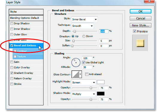
These are my headings from my Preliminary school magazine task and my Main task music magazine. WGSB the news is my Preliminary task heading and FTT my main task. Laying the two out together like this i think you can clearly compare the two. Looking back at my Preliminary task heading now i hate it and cant believe it looked like that. I think personally the font is too small for a magazine, and clearly world not grab the attention of the audience, the effects used looking back at it now are very plain and very boring I have used Bevel and Emboss, Drop shadow and an outer glow. Compared to my main task heading it is a lot more vibrant a lot more colourful and very interesting.
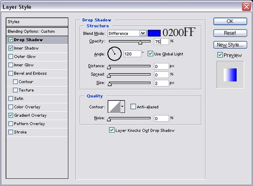
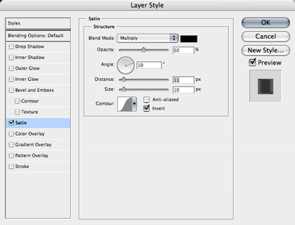
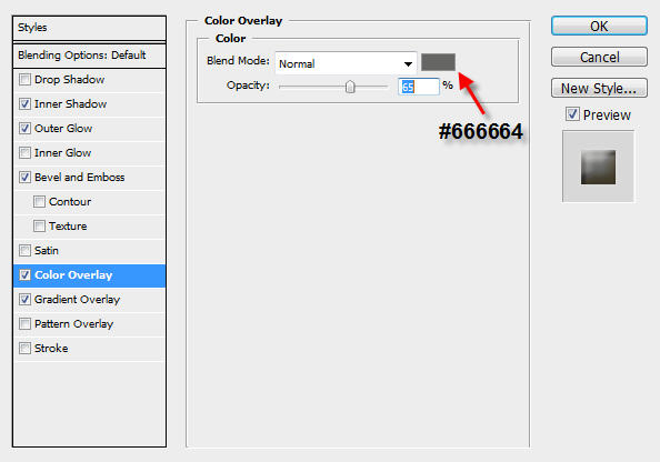
The effects used on my main task are a lot more exciting and in my opinion really does grab the audience in! For a start the font used is 84 rock which i downloaded from dafont.com, this font reflects the rock/indie target audience that i was trying to appeal to. The jagged edges give it a rock star sense like it has been smashed up on a late night after a concert. I instantly wanted my heading to be red after taking my photos, with my model wearing red lipstick i wanted that style to match up. Without the effects in Photoshop that i used my heading would look very boring and very average. The effects take it to another level and in my opinion give an indie feel to it. The effects i used were Drop Shadow, Inner Shadow, Bevel and Emboss, Satin, Colour Overlay and Pattern Overlay. A lot of effects but they all add up to a very attractive heading which is pleasing on the eye.
Mise-en-scène of images
The picture was of my brother, I tied a knot in his football boots and placed them around his neck, in my opinion it gave the impression he had just finished a match. I was making my Prelim magazine mainly sport based so i thought this image reflected the style of my magazine very well. Other mise en scene items i used was the costume of my brother, i used the school rugby kit to make it look like he had just finished playing a match. Taking the picture i had lights shining onto his face, however I also used the brightness toll in phohtoshop to add some colour to his face and his kit. I did this simply to make sure the picture was bright enough and clear enough on my front page.


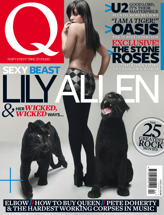
I decided i wanted a natural picture for my Main task front page. The only thing i would add to my model would be make up, and of course clothes! I didn't see the need for props to be added to my picture i wanted the focus to be on my main character. Researching into similar media products i noticed that many magazine front page pictures don't usually use props. For example this edition of Q and NME. The lighting of my picture was very important i wanted my model to be clear to the audience but not really bright! I positioned a normal lamp behind her and started taking the photos, by accident a beautiful pattern formed on the wall behind. I thought there was enough lighting on her face and on the overall picture without me having to add extra lighting using Photoshop, if i had done that it would of lost the pattern and she would of looked very bright. After taking the picture i realised that i had accidentally cut off her some of her hair, however in the final production of my magazine it did not matter because my heading covered it. Before i started taking the pictures i added some make up to my model, red lipstick, foundation and eyeliner. Whilst taking the photos i realised how much her lips shone out of the picture, i decided to make them the vocal point of my front page . I wanted my heading as close to the colour red of her lips as possible i think i achieved this. My pictures were not %100 perfect for my front page, i had to use some special effects in Photoshop to clear any spots or lumps in her skin, to smudge tiny parts on her sin to blend more colour into her face and and i also used the effects to darken her eye shadow. The effects i used to achieve this was the burn tool, smudge tool and the spot healing tool. These effects give the model perfect skin.
Costumes and Props
Clothes were less of an importance to me than m
ake up was. This is because i knew i wanted a close up shot of my model, not a medium shot where my audiences could see what she was wearing. However i couldn't just dismiss clothes altogether. I wanted something that would cover her neck so it would still be in the photo but not dominating the picture. I think the fur collar did this, it adds sophistication to the picture, and i think it works well with the indie music genre i was going for.
 People
I wanted an indie feel to all of my pieces of work, my model was obviously very important in all of the three aspects of work I have done. I wanted her to reflect the indie look at the moment. I wanted her to look the same as most indie chicks my target audience would see on similar magazines for example Q and NME. However this was going to be hard because I knew I wanted a close up picture of my model, so I had to enhance clothes on the neck and make up to reflect indie chicks at the moment. I think the fur coat she is wearing gives off the indie message very well. Looking back now though I wished I had maybe put a chain on her, just to add another element to the picture. I think the make up looks very good and also reflects an indie chick well, the bright bulging red lips gives off a very sexy and seductive pose, that a lot of young men would find appealing, I think the dark eye shadow enhanced by the burn tool on Photoshop brings out the colour of her beautiful eyes. I think I have made an indie chick for my front page and it does reflect a lot of pictures you see on Q magazine, which was the look I was going for in the first place!
Title font and style
My title's have changed dramatically since finishing my Preliminary Task. My title on my Prelim was plain and very average. It did not stand out off the page like my Main Task title does so well. I think my main problem with my Preliminary Task title is that it doesn't stand out enough! My background pictures is of lightly colored trees, but using effects to make title a lot better, actually ruined the heading with me using an inner glow with the colour white, it almost made the title invisible on the page.
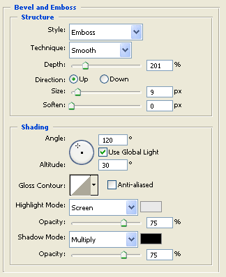
I obviously didn't want this simple yet hugely effective mistake happening on my main Task. I used a light background and a strong red font to make it really stand out on the page. Using faint colours for a background and having demanding bright colours for my heading really helped me, and made my title look fantastic. However there was one effect that truly made my title really stand out on the page and in my opinion gave it individuality. That effect was Bevel and Emboss, it basically makes the title look all smashed up and gives it wonderful jagged edges. I personally think the title reflects the indie/rock audience i was going for, it looks like it has been smashed up on a late night after a rock concert, or even like its a guitar and it has been smashed up at the end of an amazing concert.
The style of my two magazines are dramatically different! My Preliminary Task is very light hearted very poorly colored. At the time i did not know how to make the picture of my brohter have an invisible canvas, this made my magazine look very poor. With just a random white background in the middle of a grassy background it did not fit into context very well. The blue and yellow font works well because it is the school colours, but in practicallity terms you cant see the yellow text becasue of the background. There is also a lot of empty space that now looking back at my Preliminary Task i wish i had filled it up with images or just even more cover lines. The overall style of my Preliminary Task magazine front cover, is quite emptey and plain. The colours used are obviously the wrong choice the blue works well but the yellow on that faint background makes it very hard to see the text. The picture of my brother in the bottom right hand corner is poorly done on my behalf. His hands have faded a lot making it look very unprofessional, with the new skills i have learnt i would probably use the blur tool to just smooth the rough edges over.

Written content:
The written content in a magazine is very important and vital for success. In my opinion the front cover image makes your target audience buy the actual magazine, but the written content is what will keep them to buy your magazine very month. I had to consider using colloquial language and also a conversational tone of informing my audience.
The piece of work with most of my written content included is the double page spread. I chose to make it an interview format instead of a long article with questions included without notifying the audience. I chose this type of double page spread question answer technique, because during my research I realised nearly all of the popular music magazines carry out this technique, including Q and NME. My double page spread format was with the question in bold and in red, I wanted the question in red to keep my house style running smoothly. The answer was then below it in black. I chose to have my question in bold and in a different colour so it was easily distinguishable from the answers and to my audience.
Music genre and how my magazine suggests it
My music genre is indie/dance. These two type of genre may seem very far away from each other, but there not with most genres playing at popular music festivals including Reading where I would expect my target audience to hang out. These two genres are also reflected in Q magazine a hugely popular music magazine.
I think my front page (above) in particular really shouts and gives off the message that it is an indie based magazine. The cover lines for me is the main feature, with such band names on the front cover as "Example, Florence and the Machine, Kasabian and Lilly Allen, these popular bands/artists really do reflect the indie music scene at the moment in the UK. Another element of the front page that gives off the message that it has an indie genre is the sticker effect located in the top left hand corner. The written content in the sticker states "win concert tickets: Glastonbury and Reading included inside" these are two extremely popular and famous music gigs that my target audience would regularly visit to see their favourite artists perform live.
My contents represents my genre which is indie/dance in my opinion very well. With popular bands and artists mentioned in my contents for example Kings of Leon, Kasabian, Coldplay and Owl city. I would expect my target audience to listen to all of these bands. Another aspect that represents my genre is underneath the heading "News" it states "Oasis tour, really?". This dramatic and unbelievable news is clearly going to grab the attention of my readers because Oasis getting back together is unheard of, let alone an actual tour, that is why I put the "really?".
In terms of effects to show my audience my genre, I think my title "FTT" works well with the indie genre. I have used a number of effects on the title, one for example is Bevel and Emboss. This effect gives the title its crinkled up edges, which in my opinion looks like it has been smashed up on a late night after a gig, or even like a guitar has been smashed up after a memorable gig by a famous band!
Layout
Before I started my front cover, contents page and double page spread I produced drawings and possible layout of how I wanted them to look. To generate ideas and inspirations for my three pieces of work I read through Q magazine and NME to find out what layout I should be aiming for. I decided to only put one picture on the front cover, simply because a lot of popular magazines go for this layout and I didn't want any attention to be drawn away from my model.
 Contents pages
I made my main task music magazine contents to look scruffy and everything not perfectly in line. This is because when researching into similar music maga
zines for example Q and NME, I noticed both of their contents pages where scruffy and not perfectly in line with everything. In comparison to my music magazine contents and my contents page from the Preliminary school magazine task, the school magazine contents looks very neat, the sections are centralised, which makes it look very average and boring, the yellow background is very dominating and takes up of the audiences attention when looking at it. And finally there is so much space in this contents! I really should of filled it up with other pictures or at least more cover lines telling the audience what's inside.

No comments:
Post a Comment